Autarkie Farms
Autarkie Farms are a revolutionizing agriculture start-up, they aim to create create an integrated ecosystems where everything works together, from soil to animals to water systems. their closed-loop approach transforms traditional farming by eliminating external dependencies and converting waste into valuable resources. Beyond production, they also invite visitors to experience this living laboratory of sustainability, where nature's principles guide innovative agricultural practices that benefit both land and community.
Client
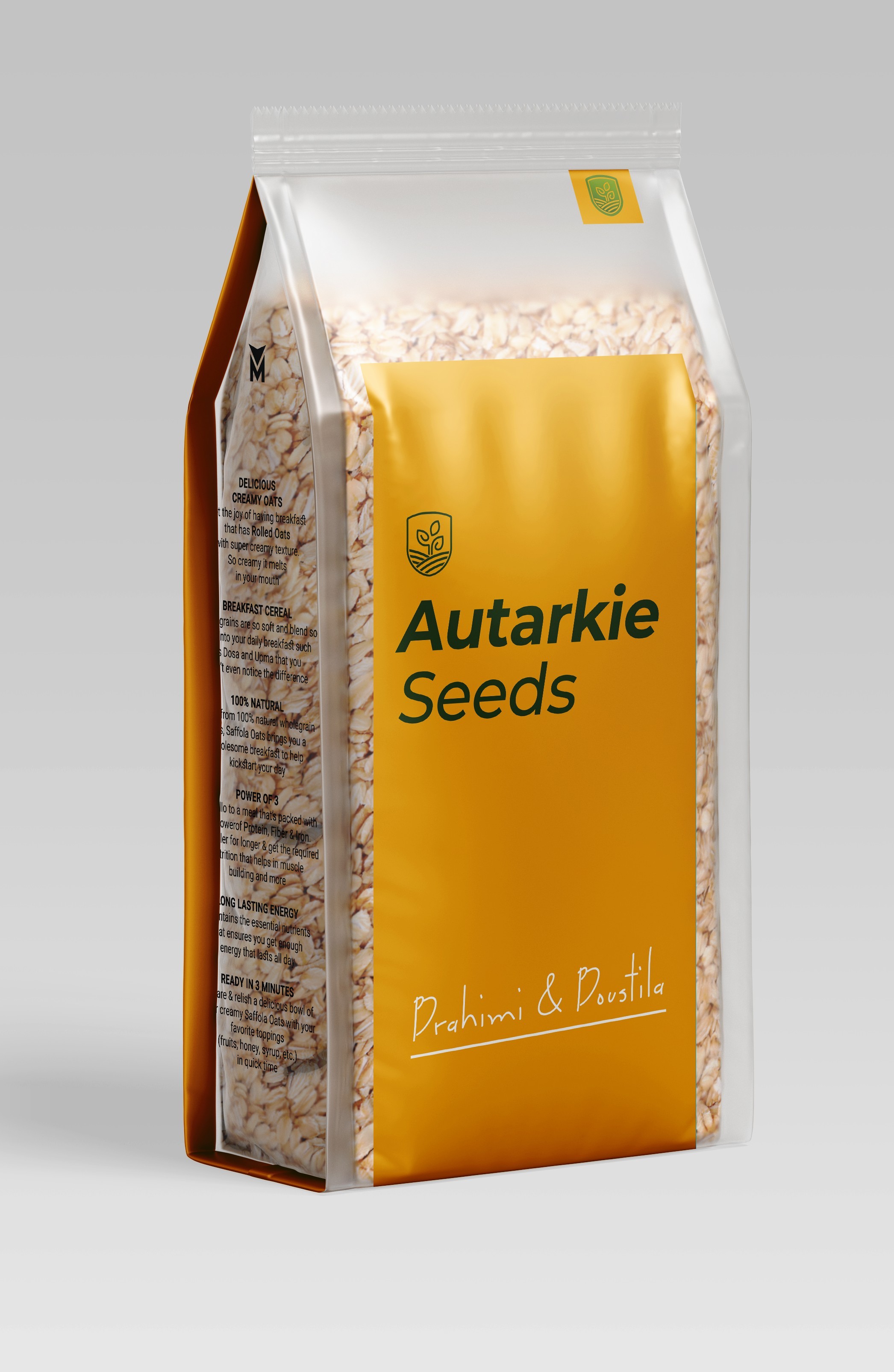
Autarkie
Service
Logo
Branding


Autarkie Farms, meaning self-reliance in German, is a self-contained haven offering stunning views. They grow everything they need on-site and invite guests to enjoy their fresh, organic produce through "natural bio bites." It's a sustainable escape for those seeking immersion in nature's bounty.


The icon we created combines five key elements:
The circular border represents our closed farm system and creates a strong, memorable boundary for the design.
The flowing waves evoke the fertile land of the farm, instantly recognizable as agricultural terrain.
The two leaves at the center form opposing arrows, symbolizing the infinite regenerative loop that's at the heart of our self-sufficiency philosophy.
The border combined with waves cleverly suggests the shape of a well, nodding to our water independence.
The plant elements represent our diverse crops and harvests, completing the story of abundance that Autarkie Farms promises to deliver!


